


Overall, housing looks flat in Q3
By Gavin R. Putland
In proportion to trend per-capita GDP, the Eight Capital Cities house-price index rose in Q2 and Q3 of 2012, although the rise is barely perceptible in the following graph (red curve). Meanwhile the seasonally-adjusted number of private-sector building approvals (black) was at mid-2011 levels, notwithstanding interest-rate cuts in November & December 2011, and May & June 2012.
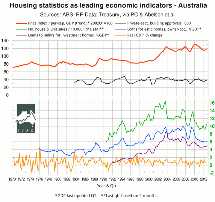
If the number of house and unit sales recorded by RP Data (green curve) was responding to rate cuts in Q4 of 2011, the rally was short-lived, even if we allow for a seasonal slump in the following quarter (the sales figures are not seasonally adjusted). The current effort to rise off the canvas, presumably in response to the later round of rate cuts, is more convincing, and has lifted turnover distinctly above the “GFC” trough. Be warned, however, that the last quarterly point plotted in the graph is based on only two months' data and that the last eight months' figures (at least) are subject to revision.
The two rallies in the number of sales have not been reflected in ABS figures on value of lending (which are seasonally adjusted). In the above graph, the value of lending for “owner occupation (secured finance) - purchase of other established dwellings”, aggregated quarterly and scaled to (seasonally adjusted) GDP, is shown in blue. The aforesaid rate cuts seem to have produced two upward steps superimposed on a gradual downward trend. The value of lending for “investment housing - purchase for rent or resale by individuals”, similarly aggregated and scaled, is shown in purple. It has risen slightly since early 2011, but again the rises seem to coincide with interest-rate cuts. Both lending curves are still below their GFC minima.
GDP growth for Q3 will be released on Dec.5.*
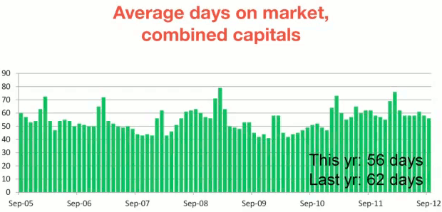
Consistent with the recent upturn in the number of house and unit sales, the average time taken to sell a home has declined over the year to September and over the two months to September, as shown in the following graph (from RP Data's Australian Housing Market Update, November 2012). If we ignore the summer peaks, we see that the time to sale is historically high, but slightly below the GFC peak of September 2008.
The number of properties advertised for sale likewise declined in the year to October, but rose in the last few months to October, and is above the GFC peak of late 2008, as shown in the next graph (from the same RP Data update).
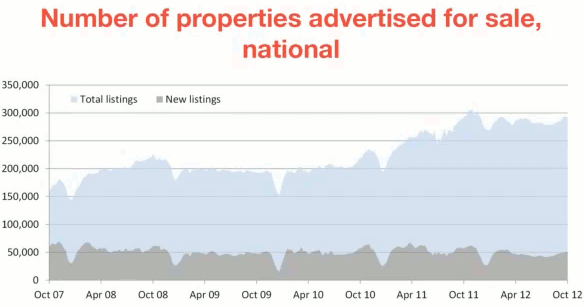
For comparison, the national “Stock on Market” graph from SQM Research was flatter over the 15 months to October and just slightly below the GFC peak. By RP Data's measure or SQM's measure, stock levels have been elevated for a long time.
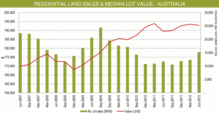
According to the following graph from the Housing Industry Association (Media release archive, Oct.18, 2012), the median lot value in June 2012 was just slightly below the peak of March 2011 (red line). Both values, however, should be regarded with caution in view of the widespread “incentives” offered to buyers. The same graph shows that the quarterly number of residential land sales (green bars), like the number of house and unit sales, has risen above the GFC trough.
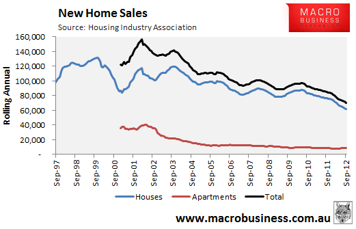
But new home sales are making the GFC look good. Here are the 12-month rolling aggregates (graphed by Leith van Onselen):
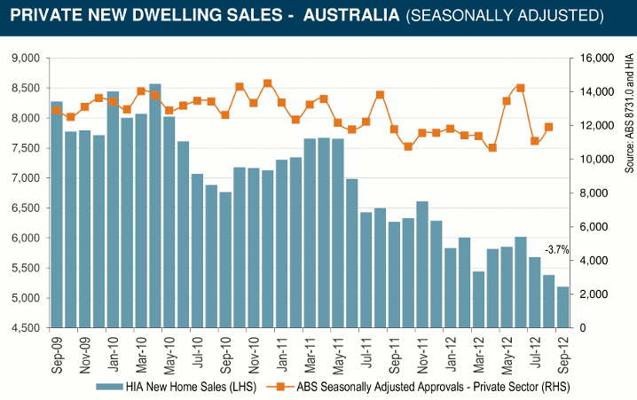
And here are the monthly figures from the HIA (Media release archive, Oct.30, 2012), together with private-sector building approvals (already mentioned):
[P.S. (Nov.16, 2012): Rental vacancy rates, nationally and in Adelaide, Perth and Melbourne, have changed little over the last year or the last month.]
The overall impression is of a market remaining in an almost GFC-like state in the teeth of repeated cuts in the cash rate, which has fairly been described (e.g. by Shadow Treasurer Joe Hockey) as an emergency low. While mortgage-servicing costs are comfortable for home owners who have accumulated a sufficient margin of equity (not to be confused with the 2007-8 cohort or the 2009-10 cohort), the numbers still don't add up for negatively-geared investors. For example, if their (nominal) interest paid and forgone is 6% per annum while their rental yields are 4% per annum, they need (nominal) capital gains of 2% per annum just to cover the interest, to say nothing of rates, land tax, maintenance, and (if applicable) agents' fees, body-corporate fees, and looming retirement from paid employment. To justify their positions, they need either a convincing run of rising prices or further cuts in interest rates. The likelihood of the latter will be discussed in the next post.
__________
* The top graph has been modified since the last update. The sources for the home-price index are:
- 2002 Q1 onward (nominal): ABS 6416.0 Tables 1–6;
- 1986 Q2 to 2002 Q1 (nominal): ABS 6416.0 Table 10;
- 1970 Q1 to 1986 Q2 (real): BIS-Shrapnel, Real Estate Institute of Australia, ABS; consolidated by Treasury; forwarded via Productivity Commission; inflation-adjusted and graphed in Abelson, Joyeux, Milunovich & Chung, “House Prices in Australia - 1970 to 2003 - Facts and Explanations” (Research Paper 0504, Dept. of Economics, Macquarie University, 2005), Figure A1 (p.26);
- CPI: ABS 6401.0 Tables 1&2, series A2325846C;
- Per-capital-GDP (current prices, trend): ABS 5206.0 Table 1. The trend figures from the ABS start in Q3 of 1973, but the unsmoothed (“original”) figures go back further. Accordingly, the available trend figures are extrapolated backward in one-year linear segments, replicating the year-on-year percentage changes in the unsmoothed figures. The earliest linear segment is extended back another half-year. Thus the timing of the 1974 peak in the red curve is not in doubt, but shape of the preceding upswing is less certain.
Sources for the other curves, in descending order, are as follows:
- Number of private-sector home-building approvals, seasonally adjusted (black): ABS 8731.0 Table 6, series A422006R, aggregated quarterly;
- Number of house/unit sales (green): RP Data (various releases), aggregated quarterly;
- Lending to buy established homes for owner-occupation, seasonally adjusted (blue): ABS 5609.0 Table 11, series A2413062F, aggregated quarterly, divided by seasonally-adjusted GDP in current dollars (ABS 5206.0 Table 1);
- Lending to individuals to buy investment homes (purple): ABS 5609.0 Table 11, series A2413064K, aggregated quarterly, divided by seasonally-adjusted GDP in current dollars (as above);
- “Headline” GDP — chain volume, seasonally adjusted, % change (yellow): ABS 5206.0 Table 1.
[Text last modified Nov.16, 2012.]
