


The Great Australian Land Bubble - by State and category
Gavin R. Putland dissects Table 61.
The latest release of the Australian System of National Accounts (ABS 5204.0) includes aggregate land values at June 30, for various categories of land use, from 1989 to 2012 (Table 61), and GDP for the respective financial years (Table 1). These figures were used in an earlier post to plot the ratio of aggregate land value (in each category) to GDP.
The aggregate land values are resolved not only by category but also by State (or Territory). The closest State-based analog of GDP is Gross State Product (GSP), which the ABS releases as part of the annual State Accounts (ABS 5220.0). However, the State Accounts for 2011-12 will not be available until Nov.21. In the mean time, the best available measure of the size of each State's economy is the State Final Demand (SFD), which is released as part of the quarterly National Accounts (ABS 5206.0, Tables 22–29). So, for the purposes of normalizing aggregate land values in a State to the size of the State economy, we can divide by SFD. The results are shown in the following graphs.
The ABS house-price indices (6416.0 Table 10) suggest that the land market in each mainland State peaked in 1989 or slightly later. So the first two graphs begin at a peak in the land market.
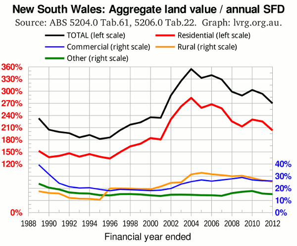
In NSW, the bubble popped of its own accord in 2004. Since then, land values relative to SFD have trended downward, responding only weakly to the first mining boom (2006 peak) and the First Home Owners' Boost (2010 peak).
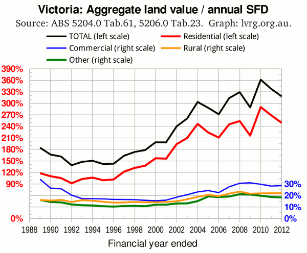
Victoria, in contrast, had three prominent peaks, each higher than its predecessor. The height of the 2008 peak may be related to the First Home Bonus, introduced in January 2007, which was a State-funded supplement to the Federally-funded First Home Owners' Grant.
Queensland was late on the upswing, hitting bottom in 2001 (the post-GST slump) and missing the 2004 peak, but then topped out well before anyone heard of a “GFC”. The response to the FHOB was particularly strong.

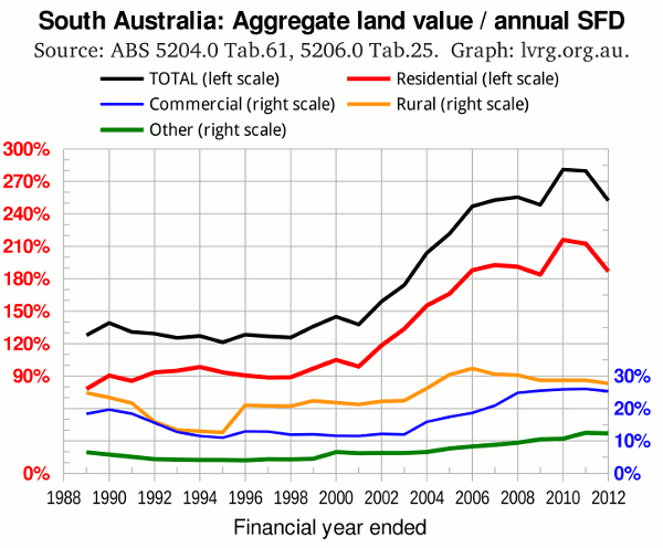
South Australia might be described as an understated imitation of Queensland, peaking in 2008 (in synchronism with the “GFC”) instead of 2006.
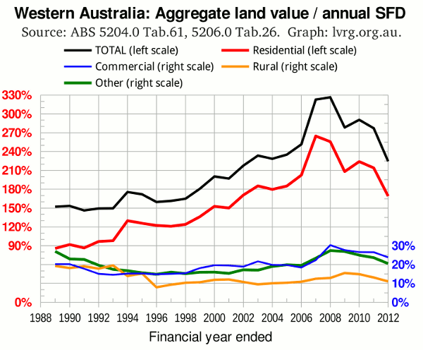
Western Australia, as one might expect, shows the strongest response to the first mining boom, hence the most pronounced “GFC” bust. The response to the FHOB and the second mining boom was curiously weak, and the subsequent decline has been precipitous.
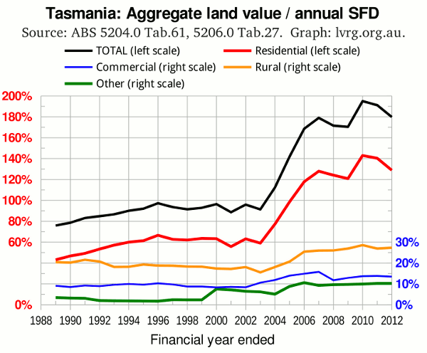
Tasmania was even later on the upswing than Queensland. But by late 2003 it was widely reported that investors who found themselves priced out of Sydney and Melbourne were turning their attention further south, pushing up “house prices” in Hobart. The ensuing upswing was rapid, but did not reach the heights (relative to SFD) of the mainland States.
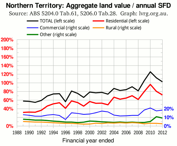
The Northern Territory showed little excitement prior to the “GFC”, but responded strongly to the subsequent stimulus measures.
The Australian Capital Territory, not surprisingly, tended to synchronize with NSW, and likewise never regained the heights of 2004 (although it came close).
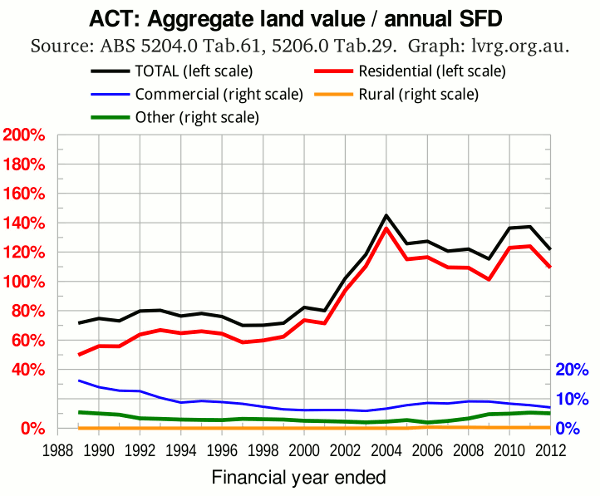
A common feature of all the graphs is the near-parallelism of the black curve (“total”) and the red curve (“residential”), indicating that the bubble was a mainly residential affair.
The peaking of land prices in 2004 (NSW, Vic, ACT) or 2006 (NSW, Qld) or even 2007 (Tas) is too early to be the result of “contagion” from any recognized external cause. It is confirmation that the preceding run-up in prices was a speculative bubble.
