


Seeking indicators of GDP in Q3
By Gavin R. Putland
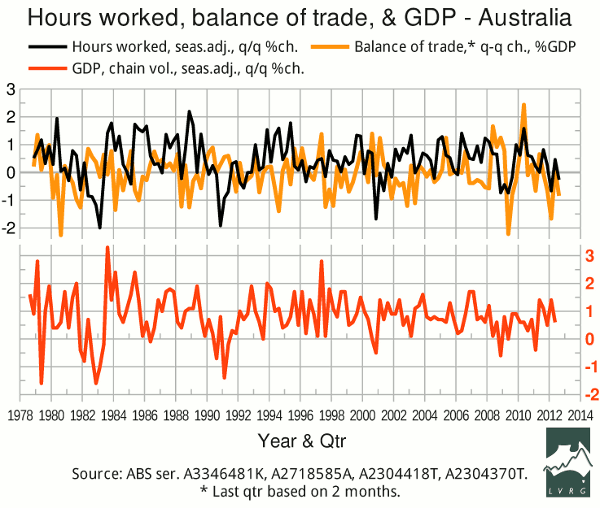
In the following graph, the black curve shows the quarterly total of hours worked (ABS 6202.0, Tab.19). The yellow curve shows the contribution of the change in the balance on goods and services (ABS 5368.0, Tab.1) to the change in GDP (at current prices). And the red curve (bottom) shows the quarterly “headline” change in GDP up to Q2 of 2012 (ABS 5206.0 Tab.1). Notice that the four biggest dips in hours worked correspond to notable contractions in GDP.
Writing in May, I noted the simultaneous contractions in hours worked and in the balance of trade in a falling housing market, and concluded that “on the balance of probabilities, the March-quarter GDP print, to be released on June 6, will be a contraction.” The GDP print was strongly on the less probable side. In the September quarter, the “simultaneous contractions in hours worked and in the balance of trade” were smaller than in the March quarter.
So, while the continuing low turnover in the housing market, in spite of low and falling interest rates, suggests that Australia's business model is broken, the total hours worked and the balance of trade do not show any clear sign of collapse in Q3 of 2012.
