


Investor-FHB imbalance approaches tipping point?
By Gavin R. Putland
On 10 December, the ABS released housing-finance figures for October 2013 (ABS 5609.0). In the following graph, the seasonally-adjusted value of lending for “owner occupation (secured finance) - purchase of other established dwellings”, aggregated quarterly and scaled to seasonally-adjusted GDP, is shown in blue. The seasonally-adjusted value of lending for “investment housing - purchase for rent or resale by individuals”, similarly aggregated and scaled, is shown in purple. If the October figures are representative of the quarter, the owner-occupation curve has at last risen above its “GFC” minimum. Perhaps more significantly, the investment curve has almost touched the owner-occupation curve. The last such near-miss was in Q4 of 2003, and was immediately followed by a fall in investment lending.
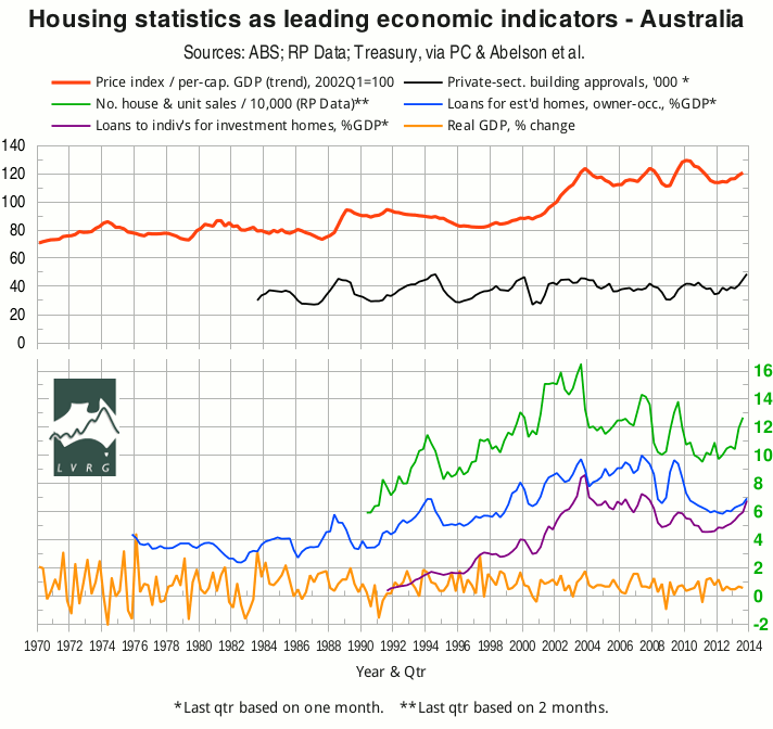
The ABS Eight Capital Cities house-price index, scaled to per-capita GDP, continues to rally at a pace reminiscent of 2006 and 2007 (red curve), assisted by 200bp of cuts in the cash rate (beginning in November 2011). The above graph shows the index up to Q3 of 2013. As RP Data's 5-city daily dwelling-price index has had an almost continuous bull run since mid-year (assisted by the interest-rate cuts of May and August), we can expect the upward trend in the ABS index to continue into Q4. Any sudden fall in investment lending would be expected to arrest that trend (cf. 2003-4).
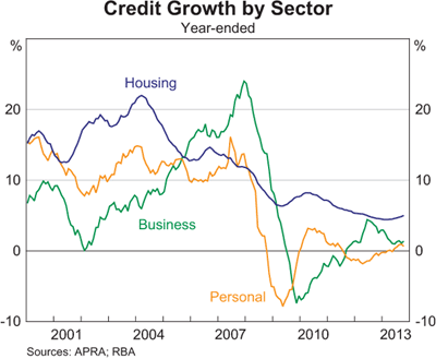
The rally in lending (blue and purple curves) has been reflected in the number of house and unit sales (green curve, updated from RP Data's Monthly Property Market and Economic Update, November 2013, p.12) and, belatedly, in the seasonally-adjusted number of private-sector building approvals (black curve, from ABS 8731.0). It is confirmed by the modest bounce (from a record low base) in year-on-year housing credit growth as recorded by the RBA (below), and is correlated with recent trends in residential land sales and new home sales.
The rally in the ABS house-price index is consistent with the bounce in the ratio of Australia's total residential land value (ABS 5204.0, Table 61) to GDP, as shown in the following graph by Leith van Onselen.
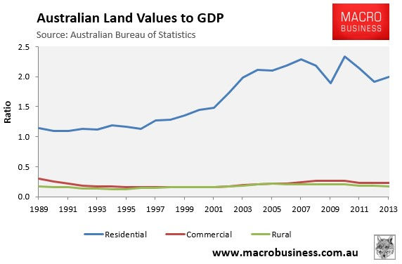
In the same article, van Onselen shows the growth in aggregate residential land values in the various states since 1989. In a later article, he divides those aggregate land values by GSP and notes that
residential land values to GSP grew in all states and territories in the year to June 2013, with the exception of South Australia... However, values remain below their peak across all jurisdictions, with values heavily underwater in New South Wales (-23%), Queensland (-25%) and Western Australia (-34%).... New South Wales and Victoria are tied for the most expensive residential land, although both are below the nose-bleed levels reached in 2004 in New South Wales...
The investors' share of housing finance commitments (van Onselen, 13 Dec., 3rd graph) has risen for 18 months in NSW while remaining comparatively steady in other states, with the result that investors' shares in most states are now eerily similar to those of 2004. In September and October 2013, the nationwide first home buyers' share of finance commitments was below the 2004 minimum. Investors may have been seduced by low interest rates; but FHBs have not.
Last time the gulf between investors and FHBs was this wide, it proved to be unsustainable: to bring more FHBs into the market, prices had to fall relative to per-capita GDP.
[Sources for the top graph were given in the post of 15 November 2012.]
