


Hours worked, balance of trade help GDP in Q2
By Gavin R. Putland
In the following graph, the black curve shows the quarterly percentage change in the total hours worked (ABS 6202.0, Tab.19), while the yellow curve shows the contribution of the change in the balance on goods and services (ABS 5368.0, Tab.1) to the change in nominal GDP. Both incorporate figures up to Q2 of 2013. The red curve shows the “headline” change in real GDP up to Q1 of 2013 (ABS 5206.0, Tab.1).
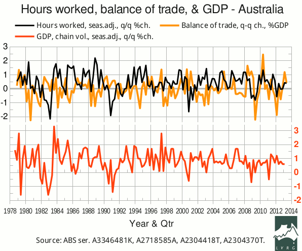
Little has changed since the last update. There's nothing here to suggest an ugly GDP “print” three days before the election.
