


Housing finance responds to RBA's defibrillator
But price palpitations continue, writes Gavin R. Putland.
The ABS has released “5609.0 - Housing Finance, Australia” for March 2013, allowing me to plot the aggregates for the first quarter. In the following graph, the seasonally-adjusted value of lending for “owner occupation (secured finance) - purchase of other established dwellings”, aggregated quarterly and scaled to (seasonally adjusted) GDP, is shown in blue. It is clearly in an uptrend, but still below its “GFC” minimum. The seasonally-adjusted value of lending for “investment housing - purchase for rent or resale by individuals”, similarly aggregated and scaled, is shown in purple — and continues to climb above its “GFC” minimum. Note that the last month's figures showed stronger growth in lending for owner-occupation than in lending for investment. First-time buyers, however, continue to be under-represented.
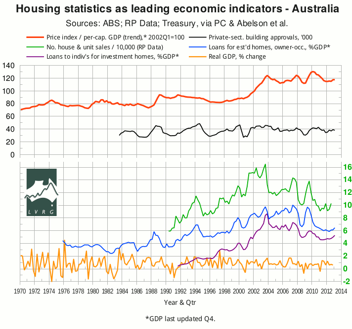
The green curve shows the number of house and unit sales recorded by RP Data, but has not been updated since the last release.
The black curve shows the seasonally-adjusted number of private-sector building approvals (ABS 8731.0).
In the first quarter of 2013, the Eight Capital Cities house-price index (ABS 6416.0) barely rose in nominal terms, and fell slightly in real terms; the CPI rise was 0.4%. The red curve in the above graph shows the index scaled to per-capital GDP; however, the change from Q4 to Q1 simply reflects the nominal change because GDP has not been updated for Q1.*
According to Residex's March update, the rises in house and unit prices for the March quarter were not significantly different from the CPI.
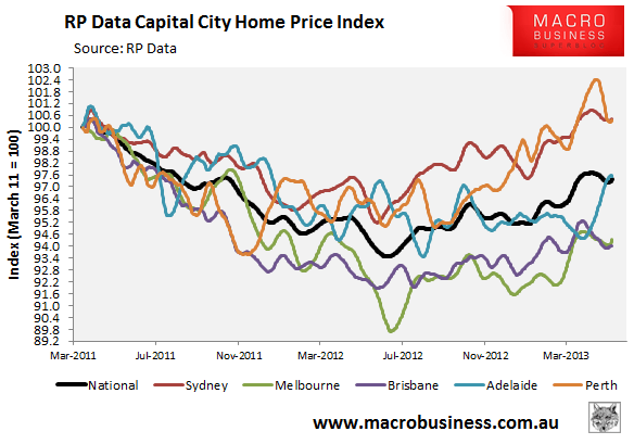
For a more up-to-date view of prices, Leith van Onselen at MacroBusiness has plotted the 14-day moving averages of RP Data's capital-city indices. Notice that in the few weeks before the RBA cut the cash rate on May 7, prices were turning down in all major cities except Adelaide. (But if we look at the last year instead of the last few weeks, all major cities except Adelaide are in an uptrend.)
According to the RBA, housing credit growth in the year to March 2013 set another record low for both the aggregate and the owner-occupation component; only the investment component was in an uptrend, as van Onselen reports. In the same article, however, van Onselen has also graphs the quarterly growth in housing credit, which has been in a slow uptrend for the greater part of a year, perhaps reflecting the interest-rate cuts of May and June 2012.
According to the HIA, sales of new detached houses are still at a 16-year low in rolling annual terms; but the monthly figures show a rally on the interest-rate cuts of mid 2012 and perhaps (as van Onselen suggests) the redirection of first home owners' grants to new homes in NSW.
In the following graph, van Onselen has compared the HIA figures on new house sales with the ABS figures on building approvals, commencements and completions (all figures being 4-quarter moving averages).
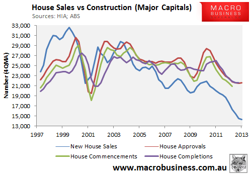
In the same article, van Onselen graphs the corresponding figures for the five mainland States and finds that Victoria, Queensland and South Australia are in most danger of a glut of unsold new houses. That danger has arisen in spite of the continuing low level of residential land sales.
In March, SQM's national residential vacancy rate continued its usual seasonal variation, superimposed on a very gradual upward trend.
In the week ending May 5, RP Data's number of homes for sale continued its seasonal pattern with no obvious underlying trend, although the total stock was still above the “GFC” peak. For a second opinion, the national “Stock on Market” graph from SQM Research was fairly flat over the two years to April and slightly below the GFC peak.
With the possible exception of RP Data's capital-city price indices, these figures are not influenced by the interest-rate cut of May 7; they reflect the December cut, which returned the cash rate to 3 percent — the same “emergency low” as in April through September, 2009.
__________
* Sources for the top graph were given in the post of Nov.15.
