


Housing: RBA rallies investors but not owner-occupants
By Gavin R. Putland
In proportion to trend per-capita GDP, the Eight Capital Cities house-price index (red curve) ticked upward in Q4 of 2012. The seasonally-adjusted number of private-sector building approvals (black) also ticked upward.
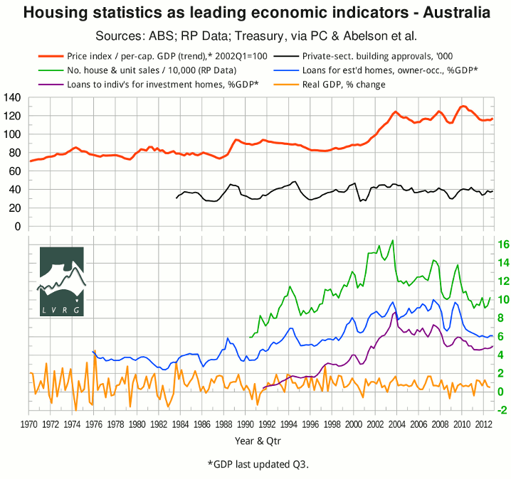
The rally in the number of house and unit sales recorded by RP Data (green curve) looks less convincing than in the last update; the difference is due to the inclusion of September's figure in the estimate for Q3 and to some revisions in earlier data.
The lending figures, unlike the sales figures, are seasonally adjusted. The value of lending for “owner occupation (secured finance) - purchase of other established dwellings”, aggregated quarterly and scaled to (seasonally adjusted) GDP, is shown in blue, and continues to fluctuate in a narrow band below its “GFC” minimum. The value of lending for “investment housing - purchase for rent or resale by individuals”, similarly aggregated and scaled, is shown in purple — and, after 175bp of interest-rate cuts, has at last risen above its “GFC” minimum.*
Similarly, housing credit growth in the year to December 2012 was the lowest on record for owner-occupation, but trending tentatively upward for investment.
The next graph, from the HIA's media release of Jan.31, 2013, shows a rally in new home sales (blue bars) coinciding with the last two cuts in official interest rates.
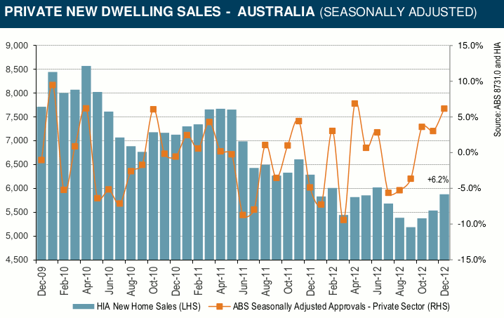
It also shows that we have seen such rallies before. Leith van Onselen has plotted rolling annual totals, which put the latest rally in a more sobering perspective. Earlier the HIA reported that residential land sales, which recovered somewhat in the June quarter, fell back in the September quarter while median prices rose; but in assessing the price trend, we need to net out what van Onselen describes as “extraordinary incentives” offered by developers.
RP Data's capital-city home price indices generally rose for the first few weeks of 2013, but then pulled back, especially in Melbourne (see the 2nd-last graph in van Onselen's summary). Residex's January update shows a slight decline in house prices for the last month (0.88% nationwide), but also reports that unit prices rose 0.5% in the last month, while house and unit prices rose 0.82% and 0.77% (respectively) in the year to January 2013; these figures are not adjusted for inflation.
In January, SQM's national residential vacancy rate retreated from its seasonal peak, but the trend still seems to be rising (that is, bearish).
In summary, an aggressive monetary stimulus has produced a tentative and uneven response. The reason is perhaps best seen by comparing the current value of the price index (the top curve in the top graph) with its value during the low-interest-rate period of 1993-4. It's hard to engineer a price “recovery” from a high base.
__________
* Sources for the top graph were given in the post of Nov.15.
