


Oz economy contracted in Q1?
Q1 of 2012 was Q2 of 2009 without the stimulus, says Gavin R. Putland.
In the following graph [or the hi-res version], the red curve (bottom) shows the quarterly “headline” change in GDP up to Q4 of 2011 (ABS 5206.0 Tab.1). The blue curve shows the quarterly change in (seasonally adjusted) aggregate hours worked (ABS 6202.0 Tab.19) up to Q1 of 2012. The yellow curve shows the contribution of the change in the balance of trade (ABS 5368.0 Tab.1) to the change in GDP, estimating the last quarter's balance of trade by averaging January and February.†
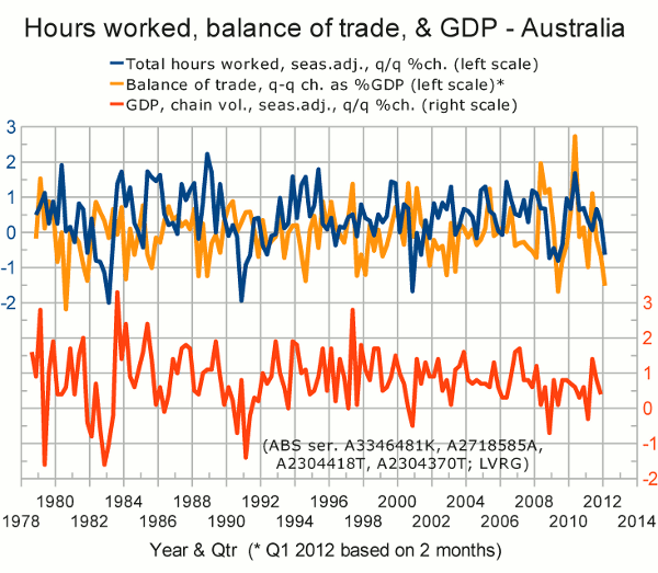
Notice that the blue and yellow curves were both negative (indicating contraction) in Q1 of 2012. The only previous occasion when both indicators were as bad or worse was in Q2 of 2009, when growth in GDP was almost zero in spite of massive government stimulus. This time around, the only comparable “stimulus” was due to a shortfall in revenue.
Also notice that previous negative spikes in the total hours worked (blue) are highly correlated with contractions in GDP. We've just had another spike.
The balance of trade is less clearly correlated with GDP over the long term (presumably because of dilution by other contributors). Since Q3 of 2010, however, there has been an uncanny similarity between the trade curve and the GDP curve; and a continuation of that similarity into Q1 of 2012 would result in a contraction in GDP.
__________
† Update (May 8, 2012): When we use the actual figures for March, we find that the yellow curve ends at −1.7% instead of −1.5%.
