


Hours worked, balance of trade will hurt GDP
By Gavin R. Putland
In the following graph, the black curve shows the quarterly percentage change in the total hours worked (ABS 6202.0, Tab.19), while the yellow curve shows the contribution of the change in the balance on goods and services (ABS 5368.0, Tab.1) to the change in nominal GDP. All figures are seasonally adjusted. For the balance of trade, the plotted point for Q2 of 2014 is based on the average of two months' data; if it took the trend into account, it would be worse.
The red curve shows the “headline” change in real GDP up to Q1 of 2014 (ABS 5206.0, Tab.1).
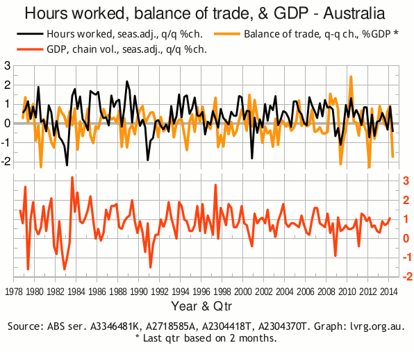
The balance of trade for Q2 is shaping up as one of the four worst results of the last 35 years. The aggregate of hours worked is not yet in the danger zone (cf. 1983, 1990, 2000, 2009), but nevertheless shows a quarterly decline, and is better correlated with GDP than the balance of trade. Leith van Onselen's 8th graph (premium content) shows that the quarterly decline in hours worked largely reflects one bad month (April); but that month is in the frame for Q2's GDP. Van Onselen also notes that the average monthly hours worked remain “near all-time lows”. As GDP indicators, hours worked and balance of trade are only part of the story; but clearly they don't help.
