


Kavanagh-Putland index back in recession zone
The ratio of property sales to GDP has suffered its biggest year-on-year fall since the recession we “had to have”, writes Gavin R. Putland.
The “Kavanagh-Putland index” should not be an “index” and should not need Kavanagh or Putland to maintain it. The reasons for that complaint are explained below. For the moment, suffice it to say that the index is an estimate of the ratio of property sales (including all categories of real property) to GDP. The following graph [hi-res version] shows the index (black) together with its year-on-year change (orange).
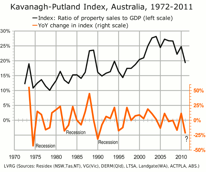
In 2010-11, the index fell by the 3rd-biggest percentage on record. The biggest fall was in 1974, and was followed by recession in 1975. The 2nd-biggest was in 1989-90, and was followed by recession in 1990-91. The 4th-biggest was in 1981-2, which was a recession year, and was followed by a worse recession in 1982-3. If the fall of 2010-11 fits the pattern, there will be recession in 2011-12.
On the basis of sales figures for the 2nd half of 2008, the fall in the index for 2008-9 was initially expected to be very large — perhaps worse than in 1989-90. However, as the First Home Owners' Boost gained traction, the actual fall in the index was smaller than in 1981-2: a technical recession was averted for the time being, but the borrowing binge that would otherwise have led to recession — as happened in so many other countries — was restarted.
The likely severity of the eventual recession may be gauged from the volume of debt represented by the height and breadth of the “hump” in the index (the black curve in the preceding graph), and from the top two curves in the following graph [hi-res version], which show that the housing market was more overvalued in 2010 than at any other time in the last 41 years.
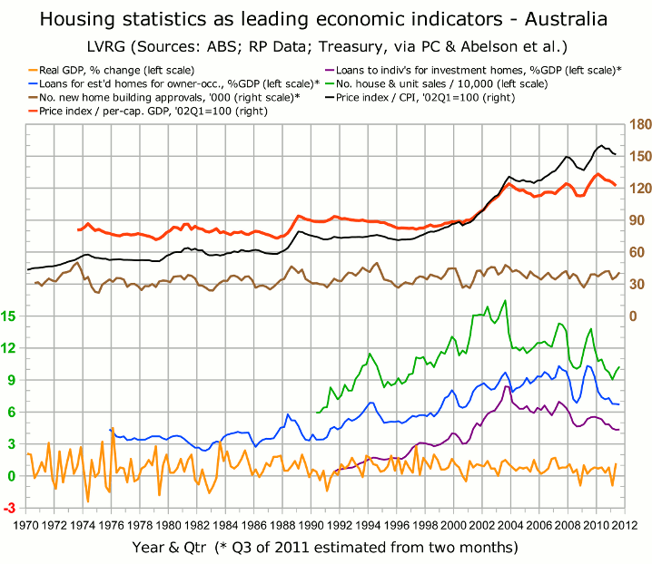
The black curve shows the home-price index adjusted for inflation (according to ABS 6401.0 Tables 1&2, series A2325846C). The red curve shows the home-price index in proportion to per-capita GDP (at current prices, seasonally adjusted, according to ABS 5206.0 Table 1). The sources for the home-price index are:
- 2002 Q1 onward (nominal): ABS 6416.0 Tables 1–6;
- 1986 Q2 to 2002 Q1 (nominal): ABS 6416.0 Table 10;
- 1970 Q1 to 1986 Q2 (real): BIS-Shrapnel, Real Estate Institute of Australia, ABS; consolidated by Treasury; forwarded via Productivity Commission; inflation-adjusted and graphed in Abelson, Joyeux, Milunovich & Chung, “House Prices in Australia - 1970 to 2003 - Facts and Explanations” (Research Paper 0504, Dept. of Economics, Macquarie University, 2005), Figure A1 (p.26).
Note that the rise in home prices relative to per-capita GDP is not explained by lower interest rates; the RBA cash rate, in nominal or real terms, was the same in early 1994 as in late 2010, and prices fell when the rate rose — to say nothing of the need to pay back the principal as well as the interest.
The other curves in the graph, in descending order, are as follows:
- Brown: Number of new house/unit building approvals (ABS 8731.0 Table 11, series A418344C + series A419084L, aggregated quarterly);
- Green: Number of house/unit sales (from monthly graphs published by RP Data, aggregated quarterly);
- Blue: Lending to buy established homes for owner-occupation, seasonally adjusted (ABS 5609.0 Table 11, series A2413062F) relative to seasonally-adjusted GDP (ABS 5206.0 Table 1);
- Purple: Lending to individuals to buy investment homes (ABS 5609.0 Table 11, series A2413064K) relative to seasonally-adjusted GDP (ABS 5206.0 Table 1);
- Yellow: “Headline” GDP — chain volume, seasonally adjusted, % change (ABS 5206.0 Table 1).
The correlations between the housing-transaction curves (brown, green, blue, purple) are clear, notwithstanding the lack of seasonal adjustment in the first two (brown, green).
Notice that large falls in lending, involving both owner-occupation and investment, are followed by price falls, and that price falls following prominent price rises tend to be followed by contractions in GDP. The one exception to the latter rule, namely the price slump of 2003–5, which was not associated with economic contraction, is readily explained by the historic improvement in the terms of trade, which added roughly 3% to GDP over the same period; the “exception” proves the rule in that economic growth was so ordinary in such favourable international circumstances.
While a large fall in lending predicts a fall in prices, a recovery in lending has no such implication; the 1986–88 lending recovery heralded a price rise, but the 1982–84 and 1990–94 lending recoveries did not. Similarly, the uptick in sales since Q1 of 2011 should not be automatically taken as signalling a recovery in prices. Indeed, there are four reasons for believing that it represents a supply-side push rather than any recovery in demand. First, the price slump continues unabated. Second, as of September 2011, stock on market continued to trend upward. Third, the uptick in sales is not matched by any comparable uptick in lending (and could even be a seasonal artifact). Fourth, auction clearance rates are higher than one normally expects in a falling market — consistent with the theory (which this writer has held since November 2010) that a higher-than-normal fraction of vendors have decided to take whatever they can get while they can get it.
Technical notes
Of the four housing-transaction curves (brown, green, blue, purple), none seems to have a clear recession threshold, either in terms of its absolute value or in terms of its year-on-year change. Two of the four do not go back far enough to include the causes of the last recognized recession, and the other two exhibit large dips that are not associated with recessions. But the year-on-year change in the Kavanagh-Putland index does seem to have such a threshold. Indeed, as the K-P index is more comprehensive — covering the entire property market, not just housing — one should expect it to be a better economic indicator.
The K-P index is an estimate of the ratio of property sales to GDP. It is called an “index”, rather than a simple “ratio”, because it is based on a varying sample due to incomplete data.
Only Victoria has sales figures dating back to 1972. Qld, WA and NT join the sample in 1979, Tasmania and the ACT in '84, SA in '85, and NSW in '89. Furthermore, because the land titles offices of some jurisdictions have monetized their data, some later figures are available only through secondary sources and include outliers and alarmingly large “corrections”, making it necessary to reject certain figures as unreliable.
The initial solution, used by Kavanagh from 1991, was to “gross up” early figures by assuming that the missing jurisdictions had fixed fractions of total sales (calculating the fractions from later, actual figures) and to replace suspect figures by interpolation. This approach enabled Kavanagh to report, in 2001, that the recognized recessions of the mid '70s, early '80s and early '90s occurred after the ratio of property sales to GDP exceeded a certain threshold and returned below it.
The current solution, proposed by Putland (the present writer) in February 2009, is to add up the property sales in those jurisdictions for which reliable figures are available, and divide by total Gross State Product (GSP) in the same jurisdictions. Thus the jurisdictions without reliable figures are excluded from the sample. Unfortunately GSP figures from the ABS date back only as far as 1984-5 and are less up-to-date than GDP. Furthermore, due to an apparent change in methodology, GSPs do not add up to GDP before 1989-90. So, for each year in which GSPs are known, the GSP for each jurisdiction is divided by the total GSP to obtain the “GSP fraction”, which is then multiplied by GDP to obtain the “estimated GSP” for that jurisdiction. For earlier/later years, the earliest/latest GSP fractions are used.
Initially, Putland's exclusion method was applied to the jurisdictions that had not yet joined the sample, while Kavanagh's interpolation method was applied to later suspect figures. However, the index as graphed above uses the exclusion method for both. For comparison, the left-hand graph below shows the latest K-P index (and its YoY change) computed by applying the interpolation method to the suspect data, while the right-hand graph uses the exclusion method (as above). The difference is reassuringly small.
A further problem is that Victoria's sales figures are for the calendar year while others are for the “financial year ended...” The present “solution” is simply to tolerate the overlap and adjust the time base for years with only Victorian figures. That is why the abscissas on the graph are in 1-year increments from 1972.5 to 1978.5 (denoting calendar years 1972 to 1978), then in a half-year increment to 1979 (denoting the financial year ended 1979), then in 1-year increments thereafter.
Needless to say, this arrangement is unsatisfactory. The obvious alternative, namely to split Victoria's figures between consecutive financial years, is worse in that it smears the time base further — which is particularly ridiculous in those years for which only Victorian figures are available.
To estimate Victoria's sales for 2011, the year-on-year change in the number of residential sales from January to May (according to RP Data) was calculated as a ratio, and multiplied by the yearly total for 2010. If the exclusion method is used instead, the latest year-on-year fall in the index becomes slightly smaller but is still clearly the 3rd-highest on record.
Concerning the deficiencies in the data, I submit that the K-P index should not be an index based on a changing sample. It should be a ratio based on complete sales figures, which should be collected by the ABS using information forwarded by the land titles offices, which obviously already collect the information for the purposes of registering titles and valuing land. To say this is not to belittle the highly localized research done by private firms for the guidance of property investors. But global figures, which are needed for the guidance of public policy at the national, state and municipal levels, should be public.
Can governments act to avoid recession?
They can, but they won't. They need to cut taxes on current income or expenditure, so that people can more easily service their current debts, and replace the revenue by increasing taxation of capital gains, so that people have less incentive to borrow and speculate in future (even if they can afford it).
Governments just don't do that sort of thing.
