

ABS tracks housing bubble & burst
The ABS has updated its Australian System of National Accounts, allowing Gavin R. Putland to update a few graphs.
The first graph shows how, in proportion to GDP, the total price of Australia's residential land has ballooned while total wages and salaries have hardly changed. The recent fall in land prices is not nearly enough to undo the damage.

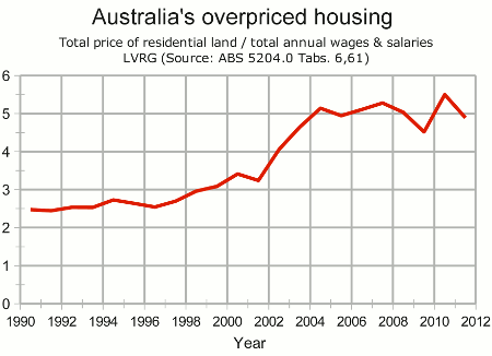
If you prefer a simple ratio of the total land price to total annual wages and salaries, that is shown in the next graph. Lest anyone suggest that the present ratio is justified by low interest rates, I point out that in 1993-4 and 1999, the RBA cash rate was the same as it is today (Nov.1).
To complete the picture, Leith van Onselen at Macro Business has a post showing how the rise in the value of dwelling assets is almost entirely explained by the rise in residential land values or, equivalently, by the increase in the land fraction of dwelling asset values.
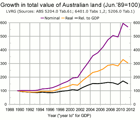
The blowout in land prices looks far more modest if we scale prices to GDP (as above) than if we scale prices to the CPI, as in the “Real” curve below.
The latest land bubble is more concentrated in residential land than the bubble of the late '80s. Between 1996 and 2010, residential prices (scaled to GDP) more than doubled while commercial prices rose roughly 65%; but from 1989 to 1996, commercial prices (scaled to GDP) almost halved while residential prices had a much shorter and shallower decline — as the next graph shows.
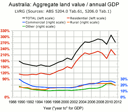
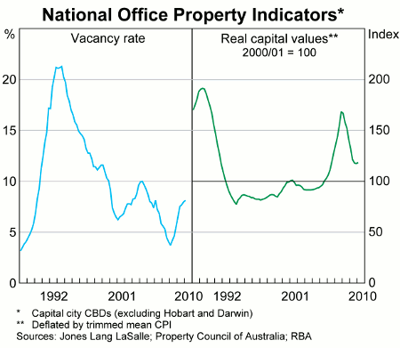
Notice that commercial land prices, in proportion to GDP, have not yet regained the bubbly heights of 1989. The behaviour of CBD office property was even more remarkable. Graph 46 from the RBA's Statement on Monetary Policy for May 2010 is reproduced below. It shows that office property in capital-city CBDs has not regained the heights of 1989 even in real terms, let alone in proportion to GDP.