


40 years of housing bubbles and recessions
Australian housing is about 45% overvalued, writes Gavin R. Putland.
In June, GMO co-founder Jeremy Grantham made headlines by claiming that Australian housing prices needed to fall 42% to return to the long-term trend. That implied an overvaluation of 72%. Grantham had little time for the popular notion that Australia will escape a correction due to special circumstances. “Bubbles have quite a few things in common but housing bubbles have a spectacular thing in common, and that is every one of them is considered unique and different,” he quipped. Interest rates were the key: “Sooner or later, the rates will go up and the game is over.”
In July, The Economist estimated the overvaluation as 61% using price/rent ratios, and concluded: “By this measure Australian property is the most overvalued of any of the 20 countries we track.”
In August, Gerard Minack of Morgan Stanley Australia put the overvaluation at 35% to 50% and warned that the main threat to stability came from the “army of loss-making middle class landlords”. That means negative gearing, which he branded a Ponzi scheme, adding for good measure: “There is no value to society from rising house prices. It is simply a wealth transfer to existing owners from potential buyers.” There's still no word on whether he'll be prosecuted for spilling official secrets.
In early September, a report by Tim Toohey at Goldman Sachs JBWere (summarized by Karen Maley) found that Australian housing was 35% overvalued in terms of affordability (compared with long-term averages), or 24% overvalued when rental values were added to the mix. Toohey denied that this amounted to a bubble, on the grounds that the overvaluation was supported by low interest rates, undersupply, and strong demand due to population growth. But if those arguments were valid, wouldn't they imply that there is not only no bubble, but also no overvaluation?
A scaled home-price index
Our own estimate of the overvaluation is based on the following graph [1,2], in which the red curve shows a composite index of home prices scaled to per-capita GDP, while the black curve shows the same composite index scaled to the CPI. For convenience, we refer to the red curve as the scaled index and the black curve as the real index.
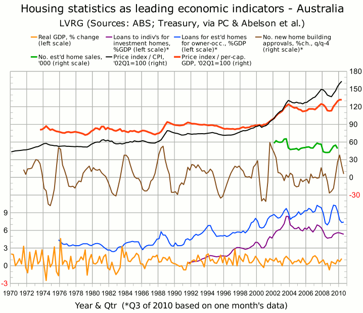
The scaled index slightly overcompensates for the rise in GDP per household — including that due to the two-income household and the post-2003 mineral bonanza — because the average number of persons per household has been gradually shrinking. In spite of that, the scaled index (red curve) is clearly at a record high — above the peaks of 2003 and 2007, more than 40% above the peaks of 1989 and 1991 (the latter being mainly due to a dip in GDP), and more than 50% above the peaks of 1974 and 1981.
But what value of the scaled index should be taken as “normal”? To answer this, let us accept the argument that price-income ratios can be high because interest rates are low. And let us not resort to the counter-argument that real interest rates aren't historically low when low inflation is taken into account. (Don't tell a borrower whose home was repossessed in the '70s or '80s what the “real” interest rate was, unless you want a free nose-job.) The present era of low inflation and low interest rates was precipitated by the “recession we had to have” in 1990–91. During the interest-rate trough of 1992 to 1994, when official interest rates (both real and nominal) were in a range that would now be regarded as normal, the scaled home-price index was almost stable. This “almost stable” value of the index may therefore be taken as an estimate of the “normal” value. The index is now about 47% above the “almost stable” level; that is, it will fall about 32% if it returns to that level.
So, using round figures on the conservative side, we estimate that Australian housing is about 45% overvalued, in which case the scaled home-price index must fall about 30% to return to normal. This assessment, if correct, does not mean that prices must fall 30% in nominal terms or even real terms; it means they must fall 30% relative to per-capita GDP.
Housing leads the economy into recession
The argument that a strong economy will prevent any substantial fall in home prices is easily debunked by considering the quarterly change in real GDP (the yellow curve at the bottom of the graph) in relation to home prices. The recession and home-price slump of 1974 have an obvious common trigger, namely the deliberate credit squeeze of late 1973. Thereafter, economic weakness generally followed, rather than preceded, falls in home prices. The recession of late 1975 occurred while home prices were still falling from the 1974 peak. The double-dip recession of 1981–3 followed the home-price peak of early 1981. The “recession we had to have” followed the home-price peak of 1989. The dip in economic growth in 2004, and the subsequent period of ordinary growth in spite of the historic improvement in the terms of trade, followed the home-price peak of late 2003. The near-recession of late 2008 (which was a recession by almost any measure except the official one) followed the home-price peak of late 2007.
By way of counterexample, one could reasonably allege that the home-price slumps of 1986–7 and 1995–7 were preceded by periods of weak economic growth. But these price slumps, unlike the others mentioned, do not look at all like bubble-bursts; the falls are not from record highs and are not preceded by sharp rises. Bubble-bursts tend to be autonomous. The GST-induced slump in home prices in the third quarter of 2000 was neither a bubble-burst nor a counterexample: GDP contracted in the last quarter of that year.
Sales lead prices into a crash
If the strength or weakness of the economy as a whole does not predict slumps in home prices, what does? To our knowledge, the best predictor is a substantial simultaneous downturn in loans for investment homes and loans for owner-occupied established homes. In the above graph, the purple curve (second from bottom) shows lending to individuals for acquisition of investment homes, seasonally adjusted, aggregated quarterly, and divided by GDP. Lending for acquisition of established homes for owner-occupation, similarly processed, is shown by the blue curve (third from bottom). Major downturns in both curves begin in 1994,* early 2000, late 2003 and late 2007, and each occasion gives at least one quarter's warning of a price decline. Of these four events, the first was triggered by a sudden rise in interest rates and the second by the GST, and the last two were the most perfect bubble-bursts that one could ever hope not to see.
The home-price peaks of 1981 and 1989 were also anticipated by peaks in lending for owner-occupied established homes (blue curve); but the corresponding figures on investment lending are not available.
The green curve shows the number of established home sales in capital cities, for which the ABS has figures from 2002 onward. This curve has two steep falls. The first of these precedes a price reversal by one quarter. The second is simultaneous with a price reversal, but the peak in sales precedes the peak in prices by two quarters. (And if we consider nominal prices instead of real prices, even the second big fall in sales precedes the price reversal.)
The correlation between sales (green curve) and lending for owner-occupation (blue curve) is striking; but lending figures turn out to be more useful for forecasting, not only because they are more up-to-date, but also because they are split between owner-occupation and investment. Two falls in sales (green curve), in late 2002 and late 2009, do not seem to announce falls in prices, but coincide with the two occasions on which lending for owner-occupation (blue curve) fell substantially while lending for investment (purple curve) kept rising. Each such “occasion” was the withdrawal of a subsidy for first home buyers: the $7000 Commonwealth Additional Grant (CAG) was introduced in March 2001, reduced to $3000 at the end of 2001, and withdrawn at the end of June 2002; and the First Home Owners' Boost (FHOB) was introduced in October 2008, halved at the end of September 2009, and terminated at the end of December. On each occasion, when lending fell due to withdrawal of the subsidy, prices kept rising, presumably because the market anticipated and “priced in” the fall in lending; but the introduction of the subsidy revived both lending and prices, presumably because the market got no warning.
In short, it seems that while a fall in sales of established homes usually portends a fall in prices, a fall in sales (or associated lending) caused by the scheduled withdrawal of a subsidy doesn't count.
The brown curve shows the year-on-year change in quarterly new-home-building approvals, including both detached houses and apartments. Notice that the first slump in building anticipates the price slump and recession of 1974. This gives us some idea what the lending figures would tell us if they were available for that time. Some correlation between building approvals and loan approvals is evident from the graph. However, as a predictor of a price slump, a fall in building approvals is less reliable than a fall in lending for established homes. This is to be expected, because a fall in construction indicates not only a fall in present demand but also a restriction of future supply, whereas a fall in sales of existing homes has no implication for overall supply.**
When will home prices fall?
The FHOB not only averted a full-scale home-price crash and a technical recession, but also re-inflated and enlarged the bubble and set the scene for a bigger burst. We didn't dodge a bullet; we dodged a boomerang. When will it come back and hit us?
To “call” a home-price crash on the basis of the latest fall in lending for owner-occupation, even if overall lending also fell, would be premature because the fall is explainable by the withdrawal of the FHOB and should therefore have been anticipated and “priced in”. The precedents suggest that the fall in prices will be announced by simultaneous falls in lending for owner-occupation and lending for investment. Instead, the latest figures show that lending for owner-occupation (blue curve) has slightly recovered from the post-FHOB slump while lending for investment (purple curve) has slightly fallen. That combination does not allow us to predict a fall in prices until there is a renewed downturn in lending for owner-occupation.
But neither does that “combination” have an exact precedent. Furthermore, the price indices mentioned so far are quarterly, unstratified, and non-seasonally-adjusted. Looking instead at the monthly, seasonally-adjusted, stratified indices compiled by RP Data-Rismark and shown in the following graph (published as graph 61 in the RBA's Financial Stability Review for September 2010), one might think that the market did not fully “price in” the end of the FHOB and that the price crash has already started.
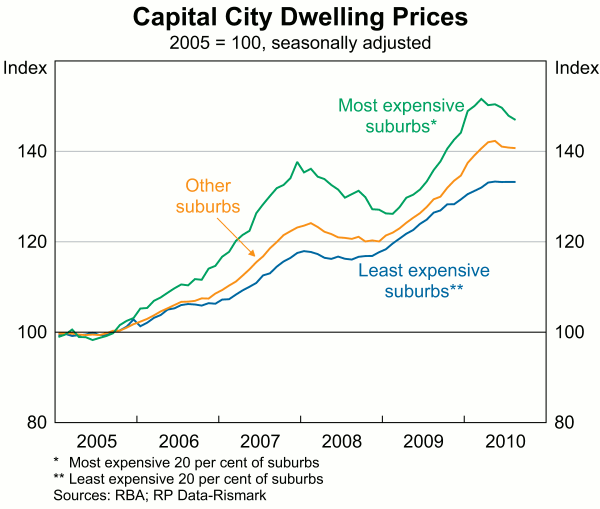
The crash has certainly started in Queensland, where auction clearance rates in Brisbane have been below 50% all year, and where off-the-plan unit buyers on the Gold Coast are looking for ways to escape their contracts in order to avoid capital losses. It has also started in Perth, where, according to RP Data-Rismark's preliminary figures, house prices fell 4.1% and unit prices 7.3% in the three months to August. But in Sydney and Melbourne, auction clearance rates since the Anzac Day weekend have been consistent with slower price rises rather than price falls.
Which bank is getting shrill and desperate?
A defender of the cart-before-horse thesis that “Strong economic fundamentals minimise the downside risk to Australian house prices” is Australia's biggest mortgage lender, the Commonwealth Bank (CBA). On 9 September, CBA released a slide pack designed to convince foreign bond holders, on whom the bank depends for about a quarter of its funding, that Australian housing, which serves as collateral for up to 60% of the loan books of Australian banks, is not in a bubble. The mere fact that Australian banks need to borrow overseas in order to support domestic collateral values should suggest the contrary.
On page 9 of the slide pack is a bar graph proudly comparing Australia's low unemployment rate with the higher rates of six foreign countries that have already had full-blown recessions, mostly caused by domestic property bubbles that popped while their economies were still apparently strong. Real home-price indices for five of those six countries plus Spain are shown in the following IMF graph [3], on which we have superimposed the curve for Australia (and the grid).
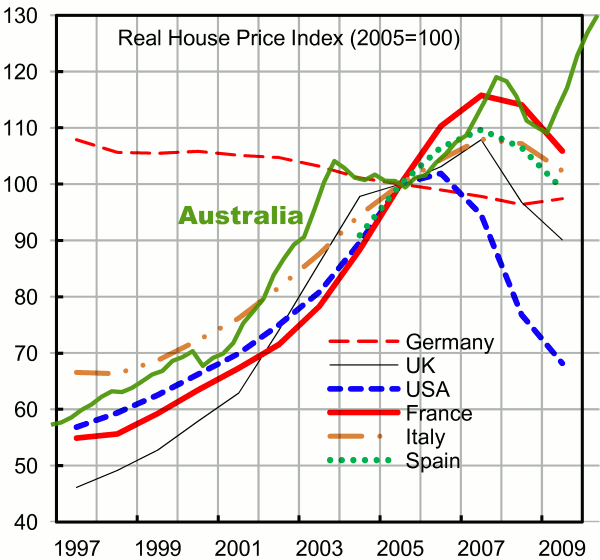
In the USA, where prices peaked in 2006, recession officially began in December 2007. In the UK, France, Italy and Spain, where prices peaked in 2007, recession began in Q2 or Q3 of 2008. Of the countries in the graph, only Germany, with its highly export-dependent economy and its exposure to U.S. mortgage-backed securities, had a recession without a domestic housing bubble. Given the consensus that the U.S. recession was caused by the U.S. housing bubble, it strains credulity to suggest that the recessions in the UK, France, Italy and Spain had nothing to do with their respective housing bubbles.
In Australia, where the peak in home prices came comparatively late (Q4 of 2007), the onset of economic contraction was similarly late: Q4 of 2008. That was the quarter in which the Rudd government woke up to the “global” crisis and announced its emergency stimulus, which averted a second quarterly contraction and restarted the upward momentum of home prices, so that a large correction is now all the more overdue.
On page 4 of CBA's slide pack is a table showing the “house price to income” ratios for three Australian cities and seven foreign coastal cities, citing the sources as “Demographia; UBS”. On September 10, Kris Sayce at Money Morning Australia pointed out that the table used Demographia's figures for all the non-Australian cities but none of the Australian ones. Using Demographia's figures across the board would have shown that Australia had the most overpriced housing — which wasn't the conclusion that CBA wanted to draw.
Concerning the shortage of housing, which CBA adduces against any fall in prices, suffice it to say that official rental vacancy rates include homes available for rent, but not homes held vacant so that they can be sold for capital gains at the most opportune time. While a bubble is inflating, speculative hoarding of empty homes creates an artificial shortage, which evaporates like dew in the sun when the hoarders try to cash in.
Such are the arguments by which CBA hopes to persuade international investors to keep rolling over its bonds at low interest rates, so that it can keep lending at low rates, which are a necessary condition for the maintenance of the high prices that CBA is trying to justify — or rather, as shown above, a necessary condition for ensuring that Australian home prices need to fall only 30% relative to per-capita GDP.
Australia's total housing debt is near enough to $1 trillion and accounts for up to 60% of the banks' loan books. Early this year it was reported that Australian financial institutions owe foreign lenders more than $800 billion, of which more than $400 billion needs to be rolled over in 90 days or less, at interest rates that will be passed on to Australian borrowers. It is a sobering commentary on our national priorities that Australian home buyers effectively pay interest to foreign bond holders in order to pump up the prices of the homes they want to buy — or, equivalently, that first home buyers must compete not only with repeat buyers, investors and speculators, but also with foreign bond holders. But perhaps we digress.
What next?
Australian housing is about 45% overvalued relative to spending power as measured by per-capita GDP. Last time prices fell, the fall was arrested by the FHOB. When it becomes painfully obvious that the effect of the FHOB was only temporary, buyers will be unlikely to fall for the same trick again. So the only sure way to prevent a large correction in prices is to increase the income available for servicing loans — e.g. by abolishing the GST. One way to replace the revenue without negating the extra capacity to service loans is to remove exemptions and concessions on capital gains tax. If this is done after home sales fall but before prices follow suit, the increase in spending power will break the fall in prices, while the higher taxation of capital gains will dampen speculative tendencies and help to keep future price growth within sustainable limits. In short, unless property owners accept higher and broader taxes on their capital gains, they will end up making capital losses.
Update (October 3): Another economist calls it a bubble
Dean Baker, co-director of the Center for Economic and Policy Research (Washington, DC), has warned that a significant rise in Australian interest rates would lead to a “sharp drop in house prices” — as Chris Zappone reports in The Age (Oct.1).
“I have noticed the run-up in Australian house prices and it sure looks like a bubble to me,” said Mr Baker, who correctly diagnosed the U.S. housing bubble in a paper published in August 2002. That puts him a year ahead of the present writer, who predicted a U.S.-led global depression in a letter to the Australian Financial Review in September 2003.
Mr Baker, like the staff of The Economist, is impressed by the blowout in price/rent ratios, whereas we have argued from ratios of prices to per-capital GDP for comparable interest rates.
Notes:
[1] Sources for the home-price index:
- 2002 Q1 onward (nominal): ABS 6416.0 Tables 1–6;
- 1986 Q2 to 2002 Q1 (nominal): ABS 6416.0 Table 10;
- 1970 Q1 to 1986 Q2 (real): BIS-Shrapnel, Real Estate Institute of Australia, ABS; consolidated by Treasury; forwarded via Productivity Commission; inflation-adjusted and graphed in Abelson, Joyeux, Milunovich & Chung, “House Prices in Australia - 1970 to 2003 - Facts and Explanations” (Research Paper 0504, Dept. of Economics, Macquarie University, 2005), Figure A1 (p.26).
[2] Other sources:
- Number of established home sales: ABS 6416.0 Tables 7,8;
- New home building approvals: ABS 8731.0 Table 11, series A418344C + series A419084L, aggregated quarterly;
- Lending for established homes for owner-occupation: ABS 5609.0 Table 11, series A2413062F;
- Lending to individuals for investment homes: ABS 5609.0 Table 11, series A2413064K;
- CPI: ABS 6401.0 Tables 1&2, series A2325846C;
- GDP and per-capita GDP (current prices, seasonally adjusted): ABS 5206.0 Table 1.
[3] IMF, Staff Report for the 2010 Article IV Consultation (July 13, 2010), p.11.
__________
* Corrected Oct.12, 2010.
** If a fall in construction occurs without a fall in demand (as suggested in a comment by “Biker”), that makes it still less reliable as a predictor of a price slump; indeed it suggests that prices will rise. (Note added Oct.14, 2010.)
