


Relax; housing might not crash this month
By Gavin R. Putland
Steve Keen, in his latest post, announces that he has chosen the graphs to be displayed on the T-shirts admitting that he was “hopelessly wrong on house prices”. Supporters on his walk to Mt. Kosciuszko will be wearing shirts with three different designs, each featuring a different graph.
Dr. Keen himself will be wearing the graph of home prices, on which five vertical dotted lines show the introductions of first home buyers' grants or supplements thereto. With the exception of the current $7000 FHOG — which was introduced to compensate for the GST but found insufficient for the task, and was therefore supplemented by the later “Commonwealth Additional Grant” — each grant was followed by a surge in home prices. The exception probably had more to do with the end of the “beat-the-GST” rush than with the inadequacy of the compensation; without this “pull-forward” effect, I would have expected the combination of the GST and the FHOG to raise prices and rents (cf. “Blowing housing bubbles”, On Line Opinion, Nov. 2009). There was another apparent exception in 1987–88, where Keen's graph indicates that the grant came after the initial upswing in home prices (presumably caused by a flight from shares to property after the crash of '87, combined with the reinstatement of the “negative gearing” deduction); but here the shape of the graph is consistent with a “second wind” from the grant.
So when you see Keen's admission “I was hopelessly wrong on house prices,” and take up his invitation to “Ask me how,” the short answer will be that government manipulation of the market can make the best-informed predictions look silly — for a time.
As to how short that time might be, Keen offers a graph showing that the number and total value of home loans plummeted in Jan. 2010, following the complete withdrawal of the First Home Owners' Boost (FHOB). This is pertinent because, as I found in my earlier survey of recent housing crashes in multiple countries, the fall in prices tends to happen one or two quarters after a fall in turnover, for which mortgage lending is a reasonable proxy in the absence of direct information on sales. That said, there are three reasons why I do not interpret the January data as announcing the next crash.
First, the Federal Government might announce yet another stimulus package to prop up the market. Noting the propensity of Australian governments to bail out property owners in order to avoid the less popular option of bailing out banks, I have even offered them some free advice on how to place their bailouts on a more sustainable fiscal footing. My suggestion is reminiscent of the idea, supported by Keen, that company shares bought in the secondary market should revert to the company after a fixed period, except that (a) my suggestion concerns the property market rather than the share market, and (b) because my suggestion would involve compensation payments, which in turn would be leveraged in the financial market, it would support prices in the short-to-medium term (although, in its pure form, it would eliminate long-term capital gains on the affected properties).
Second, Keen's graph of home loans is not seasonally adjusted, and shows that it is quite normal for loans to fall in January. The corresponding seasonally-adjusted figures indicate that lending fell in January for owner-occupants, but not for investors — who of course did not qualify for the FHOB and were only indirectly affected by it.
Third, this is not the first time that a supplement to the FHOG has been withdrawn, causing a fall in lending to owner-occupants but not to investors. The $7000 Commonwealth Additional Grant (CAG) was introduced in March 2001, reduced to $3000 at the end of 2001, and withdrawn at the end of June 2002. On that occasion, as the following graph shows, lending for owner-occupied established homes (blue curve) fell relative to GDP, but lending to individual property investors (purple curve) kept rising relative to GDP, albeit at a temporarily reduced rate, while prices (red curve) kept rising as if nothing had happened. Figures for lending and GDP are seasonally adjusted.
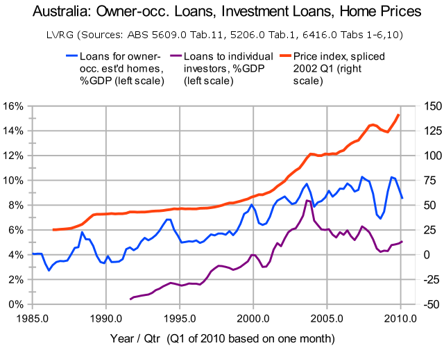
In 2002, the withdrawal of the CAG and the consequent fall in lending for owner-occupation were both anticipated, so investors were not fazed. In 2009–10, loans for owner-occupation and investment are repeating their 2002 performances, and I see no reason to conclude that prices will not do likewise for the time being.
But the same graph shows that when there is a fall in lending to both owner-occupants and investors, it is followed by a dip or plateau in the price index. And because the index isn't adjusted for inflation, a “plateau” represents a slight fall in real terms.
In view of the above, when home lending falls unexpectedly and/or falls for investors as well as owner-occupants, I'll take it as signalling a fall in prices. That signal will not be “unexpected” for me; but neither do I claim to be able to predict the exact month in which it will come.
Keen has another graph, showing that the average home-loan value failed to rise in January. But the same average rose when the FHOB was halved. This, together with the general volatility of the graph, makes me reluctant to draw any conclusion from the January figure.
In my graph above, home lending is shown as a percentage of GDP, not because it is part of GDP (it isn't), but because one would expect the value of home lending to increase with the size of the economy, so that one must divide lending by GDP in order to gain a sense of whether lending is high or low. Notice that while lending to individual investors is currently rising relative to GDP, it is far below the peak in the third quarter of 2003, and even the three-year trend is downward. Investors got spooked at the end of 2003 and have never recovered. The subsequent mineral boom increased the spending power of owner-occupants, but did not restore the confidence of investors. I take this as evidence that housing is not only overpriced, but also widely known to be overpriced. But that doesn't help us to time the crash.
[Technical notes: Monthly GDP for Jan. 2010 is assumed to be the same as in Q4 of 2009. The price index for the current ABS methodology is available from Q1 of 2002 onward. The index for the “Pre-September Quarter 2005 Methodology” is available up to Q2 of 2005. The sequences are “spliced” at Q1 of 2002, meaning that the index based on the old methodology is scaled so that it matches the new methodology for Q1 of 2002, and the index based on the new methodology is used thereafter, yielding a single continuous index. By placing the “splice” at a time of rapidly rising prices, I have avoided any dispute over trends or turning points.]
The next graph shows the number (not value) of established home sales (blue curve) from the ABS “Eight Capital Cities” series, together with the associated price index (red curve). Notice that the two big falls in sales precede downturns in the price index by one quarter. Also notice that the blue curve correlates well with the blue curve of the previous graph over the same time interval, confirming (in this case) that the total value of loans is a reasonable proxy for the number of sales.
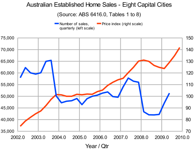
The blue curve in the last graph ends prematurely because the sales figures on which the price index is based are not released until two quarters after the price index is released, although it would obviously be possible to release the sales figures earlier because they require less processing. Having discovered that downturns in sales precede downturns in prices by one or two quarters, I deplore this unnecessary delay in the release of an important leading indicator.
In conclusion, while I agree with Dr. Keen that housing is grossly overpriced and is ripe for a crash, I caution against attaching too much significance to the January figures on home loans.
[Last modified Mar. 19, 2010.]
