


Bursting property bubbles: Sales crash first, then prices, then GDP
Examples from Ireland, Lithuania, New Zealand, the United Kingdom, Canada and Australia. A work in progress, by Gavin R. Putland. Last updated May 6.
In my multi-country survey of recent housing crashes, I reported that “a fall in turnover is a leading indicator of a fall in prices, and the lead time is usually one to two quarters,” and that (in the absence of massive fiscal stimulus!) recession begins within 9 quarters of the fall in turnover, or 8 quarters of the fall in prices. Figures on both prices and turnover (or a proxy for turnover) were not always available; and when they were, they were not necessarily comprehensive enough to be assembled into a visually striking graph showing how the dominoes fall. The purpose of this article is to assemble such graphs for as many countries as possible.
Unless otherwise specified, home-price measures are not adjusted for inflation, but GDP figures are real and seasonally-adjusted.
Ireland
On the left-hand scale, the blue curve shows the quarterly number of home-loan approvals (the “proxy” for turnover). On the right-hand scale, the red curve shows the quarterly change in the Permanent TSB house-price index, while the green curve shows the quarterly change in GDP.
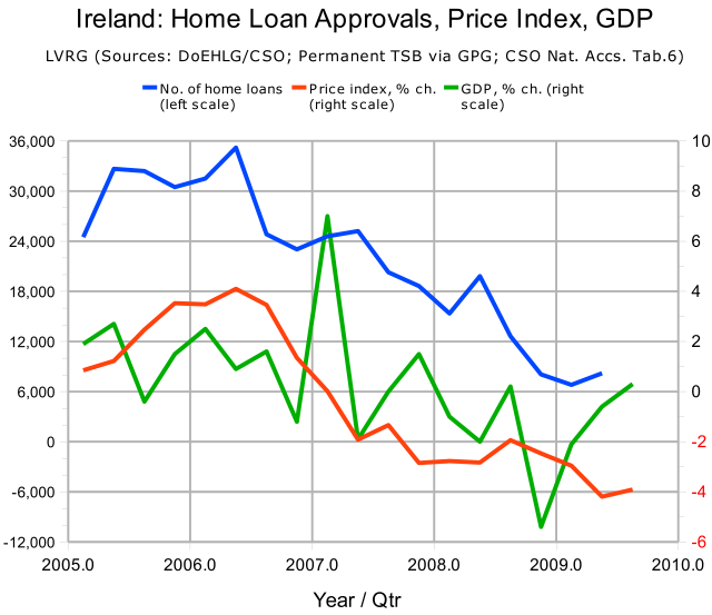
Home lending shows some seasonal variation, but clearly peaks no later than Q2 of 2006 and then falls about 80% in three years, the biggest step being between Q2 and Q3 of 2006. Home prices start falling in Q1 of 2007 (in real terms) or Q2 of 2007 (in nominal terms). The first clear case of two consecutive contractions in GDP comes in Q1 and Q2 of 2008. Even if Q2 of 2007 is taken as the onset of recession, it comes after the fall in real home prices. [Sources: DoEHLG = Dept. of Environment, Heritage & Local Govt.; GPG = globalpropertyguide.com; CSO = Central Statistics Office.]
Lithuania
On the left scale, the blue curve shows the quarterly number of home sales. On the right scale, the red curve shows the quarterly change in the Ober-Haus 5-cities price index, while the green curve shows the quarterly change in GDP. [Source for home sales: Bank of Lithuania, Financial Stability Review (2009), Fig. 54.]
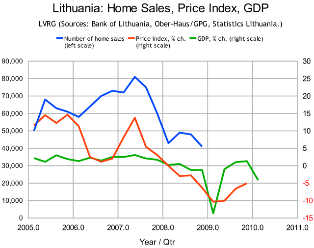
After the first dip in turnover (Q2 of 2005 to Q1 of 2006), price growth slowed but remained positive (Q2 to Q4 of 2006). But after the big fall in turnover from the peak in Q2 of 2007, prices started falling. Turnover declined in Q3 of 2007. Real prices first declined in Q1 of 2008 (and real and nominal prices declined for at least the next seven quarters). Four quarters of recession began in Q3 of 2008.
New Zealand
On the left scale, the blue curve shows the quarterly number of home sales. On the right scale, the red curve shows the quarterly change in median home prices, while the green curve shows the quarterly change in GDP.
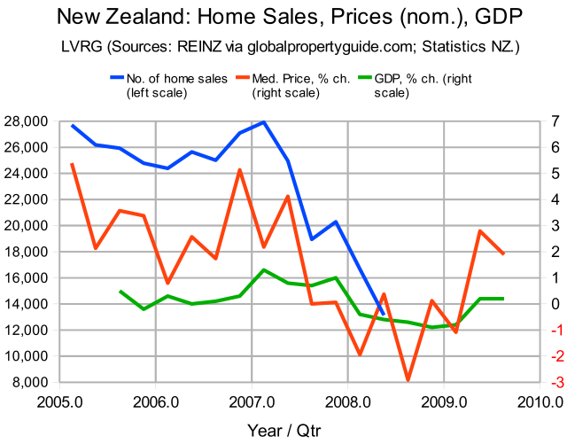
Turnover peaks in Q1 of 2007 and falls by more than 50% over the next five quarters. Home prices start falling in Q3 of 2007 (in real terms) or Q1 of 2008 (in nominal terms). Five quarters of recession begin in Q1 of 2008.
United Kingdom
The following graph by Earley & Harper (Nationwide Building Soc.) shows “house purchase approvals” (according to the Bank of England) in blue, and the year-on-year price change in red. [Source: F. Earley & K. Harper, “UK Housing Market Transactions Slump to Historic Low”, The Market Oracle, Jul. 1, 2008.]
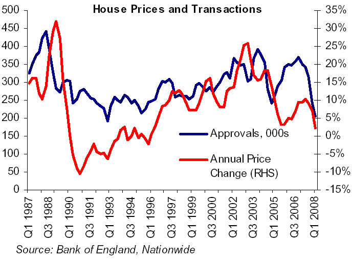
The tendency of the red curve to duplicate the qualitative features of the blue curve is uncanny, and undoubtedly worthy of investigation in itself. For present purposes, however, what matters is when the red curve falls below zero (on the right-hand scale) indicating that nominal prices have retreated, or at least close to zero indicating that real prices have retreated. There are three such falls — in early 1990, late 2005, and early 2008 — and these closely follow the three biggest falls in purchase approvals, although the lag is exaggerated because the price changes are year-on-year rather than quarter-on-quarter.
In a later article, the same authors remarked: “The ratio of sales to stocks has been a good predictor of movement in house prices. Current movements suggest that the increased supply of properties on agents' books will continue to act as a dampener to house price growth in the short term” [Earley & Harper, “UK House Price Crash Spreads Economic Chill Implying Interest Rate Cuts”, The Market Oracle, Sep. 9, 2008]. This statement is unsurprising in that a fall in the “ratio of sales to stocks” can represent an fall in sales or a blowout in unsold stock; the latter will obviously tend to reduce prices, while the former, all else being equal, will tend to lead to the latter. My contention, in this article and its predecessor, is that a substantial fall in sales by itself is a leading indicator of a fall in prices. This is to claim, in effect, that “all else being equal” is a realistic assumption — in other words, that a sufficiently large fall in sales tends to be a demand-side event.
The up-to-date graph at housepricecrash.co.uk shows that the decline in the real average home price lasted 18 months (Jul. 2007 to Jan. 2009). The recession (Q2 of 2008 through Q3 of 2009) was of the same duration, with a delay of about 9 months. The same graph shows major price peaks in Oct. 1979 and Apr. 1989. These were followed respectively by the recessions of 1980–82 and 1990–92.
Funny he should say that... (Canada)
Garth Turner at The Greater Fool is warning of a price crash in Canada. In a post dated Mar. 16, 2010, he describes the mechanism this way:
Unwilling to face reality, sellers continue to ask bubble prices. Unschooled about market conditions, the last crop of greater fools blow their wads on over-valued properties, egged on by agents sniffing drought in the air. And then, it's over.
Sales volumes fall drastically first, and prices 60 to 90 days later...
Why does it take months for prices to start to react? Because most sellers today are greedy and unrealistic, thinking bizarre prices caused by emergency interest rates are the new normal. Even as listings surge, asking prices stay at bubbleterious levels — which means sellers have to go through two or three months of lonely open houses and a paucity of offers before they understand there's only one reason in history why a house did not sell: the wrong price.
Thus, whereas Earley & Harper in the UK did not quite say what I am saying, Turner in Canada has said it precisely. But I'm not sure that his remarks are applicable to the whole Canadian market, and in any case I would have nominated a longer delay than “60 to 90 days”. As I wrote in the multi-country survey:
Monthly home sales (by value) peaked in Dec.'07, began to fall in Jan.'08, and declined about 45% to Jan.'09. Monthly average home-sale prices peaked in May '08, began to fall in Jun.'08, and declined about 12% to Jan.'09.
My thesis was subsequently vindicated: after four sluggish quarters, GDP eventually contracted by 0.9% in Q4 of 2008, then by 1.8% and 0.9% in the next two quarters. If Turner is right, my thesis points to a double-dip recession.
Watch this space... (Australia)
The next graph shows the number (not value) of established home sales for eight capital cities (blue curve), together with the associated price index (red curve).
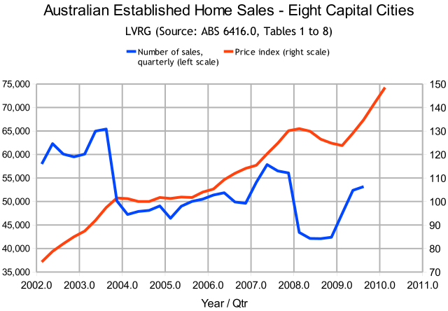
Notice that the two big falls in sales precede downturns in the price index by one quarter. On the first occasion, the fall in prices was arrested by the mineral boom (because Australia's housing market faltered comparatively early, while the economies of its trading partners were still on the upswing). On the second occasion, the Government supported prices by boosting the First Home Owners' Grant as part of its anti-GFC stimulus package, which has so far averted an official recession. But in other respects the usual pattern was followed: sales of established homes plummeted in Q1 of 2008; prices retreated for the next four quarters; real GDP contracted 0.9% in Q4 of 2008. And the year-on-year change in real per-capita GDP was negative from Q4 of 2008 to Q3 of 2009.
The use of categorized lending statistics to filter out the noise caused by first home buyers' grants was discussed in the preceding post.
Revision history
The graph for Australia was updated on May 5.
The section on Lithuania was added on May 6.
(To be continued.)
