


Why might rents rise under Labor?
By Gavin R. Putland
The proper function of the property industry is to keep the productive economy housed as cheaply as possible, so that investment in future production is not crowded out by the cost of occupying space — that is, by the cost of mere existence. To serve this purpose, the property industry must itself be productive — by building a plentiful supply of accommodation and by genuinely seeking occupants.
The industry naturally disagrees. It thinks its job is to charge the productive economy as much as possible for the right to exist. And it has been largely successful in getting its way with the legislators. In particular:
- unearned “capital gains” of individual property “investors” are taxed less than current income, including income from assets;
- “negative-gearing” losses incurred in pursuit of such gains are deductible against wage/salary income, while the cost of commuting to work is not; and, crucially,
- “investors”, in order to claim these tax benefits, need not build new accommodation, and need not succeed in their purported efforts to find tenants.
Under a tax system that so blatantly favours property speculation over production, there will be periodic speculative bubbles in the property market, each ending in a bust — as in 1974, 1981, 1989, 2003, and 2007. In the following graph, those dates coincide with prominent peaks in the top curve (red), which shows a house-price index scaled to per-capita GDP for comparability between times.†
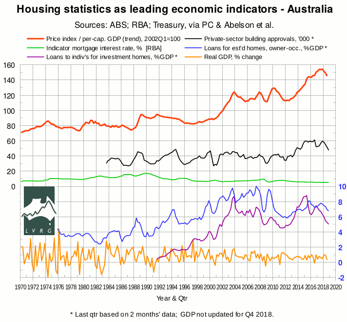
Because the speculation is debt-funded, each bust tends to be followed by a financial crunch and a recession. An exception was the peak of late 2003, which, unlike its predecessors, was an Australian peculiarity: when it subsided, the global economy was still on the upswing, boosting our terms of trade and giving a second wind to our property market. The “GFC” peak of late 2007 came later in Australia than in the USA and a dozen other countries, so that the Australian government had ample warning of its possible consequences. Thereafter, the swings of the property market had as much to do with policy interventions as with its internal dynamics.
The peak of 2010 and the subsequent slump are obviously related to the First Home Owners' Boost (FHOB) and its withdrawal. The ramp-up from 2012 to 2017 was helped by the decline in mortgage interest rates (green curve),† led by the central bank. Then came the limits on interest-only loans (March 2017), and the banking Royal Commission (established December 2017). We have now entered another period of decline, with no bottom in sight as of Q3, 2018. And we are yet to see any official statistics from the period since the Opal Tower evacuation (Christmas Eve, 2018), although Martin North, via the ABC, tells us that off-the-plan valuations have fallen by 16 percent in the aftermath.
So it wasn't just “internal dynamics” that started the current decline in prices. But, looking at the red curve, one can easily believe that prices were due to fall under their own weight in any event. Moreover, the purple curve, which shows lending to individuals to buy investment homes (scaled to GDP), peaked in Q4 of 2016; and that peak, which perhaps reflected the RBA rate cuts of February and May of 2015 and May and August of 2016, interrupted a longer decline from Q2 of 2015. Lending to buy established homes for owner-occupation (also scaled to GDP) is shown in blue. From Q2 of 2015 to Q3 of 2017, we see some evidence of investors crowding out owner-occupants (Leith van Onselen has longer-term evidence). But, since Q3 of 2017, we see a general decline in lending such as normally accompanies, and slightly leads, a decline in prices.
At last report, both lending curves are barely above their “GFC” minima and falling. They are still above their post-FHOB minima, but ought to be, in view of the decline in interest rates since then. Historically, there is not much room for further declines in interest rates, but plenty of room for further falls in lending, and for corresponding falls in the ratio of property turnover to GDP, although that ratio suffered a precipitous drop between 2016-17 and 2017-18.
Of all the curves in the above graph, the black one — building approvals— is the one that most directly relates to the current debate over negative gearing. I preface my remarks on that subject by acknowledging that the whole debate assumes the existence of a general income tax — which, by its very nature, is antagonistic to the construction and letting of housing, because these activities increase your tax bill. That problem is avoidable; for example, under a land-value tax, not only do those activities not increase your tax bill, but the tax itself may force you to engage in those activities in order to earn income to cover the tax. However, if we stubbornly insist on having a general income tax, we then need to decide whether, and under what conditions, property investors will be allowed to deduct negative-gearing losses against wage/salary income.
The incumbent conservative government promises to maintain the status quo, whereby “investors” can claim negative gearing regardless of whether they buy new or existing dwellings. The Labor opposition proposes that while existing rules will continue to apply to past investments, future investors will need to build or buy new dwellings in order to claim negative-gearing losses against wage-salary income; otherwise such losses will be quarantined to investment income, but able to be carried forward. The stated aim of the policy is to divert investors' demand towards new construction, thereby boosting the supply of housing and reducing upward pressure on rents and prices.
Treasurer Josh Frydenberg tells us again and again that under Labor's proposal: “If you own your own home, it will be worth less. And if you rent your home, it will cost you more.” His counterpart, Shadow Treasurer Chris Bowen, portrays the first claim as overblown and the second as patently absurd. Meanwhile, Mr Frydenberg's first prediction is rapidly coming true on his own watch instead of Mr Bowen's.
Negative gearing was quarantined once before, between July 1985 and September 1987. On that occasion there was no continuation of negative gearing for new homes. Hence, for the purposes of the present debate, it is irrelevant that the quarantining roughly coincided with a slump in building approvals (black curve). Hence it is superfluous to point out, in defence of the 1985-7 policy, that there is an alternative explanation for the slump in building approvals, namely the hump in interest rates (green curve). And it is superfluous to note that, by comparison with the usual direction of rents (upward!), there is nothing special about the period during which negative gearing was quarantined [van Onselen, 2015, graphs 4–12]. And it is superfluous to argue that the 1985-7 policy would have far less effect on construction now than it did then, because a much smaller fraction of the current “investment” pool goes into new homes [ibid., graphs 1–3]; the rest simply turns prospective owner-occupied homes into rental homes, and prospective owner-occupant households into tenant households. “Superfluous” unless, of course, you are emphasizing the essential difference between the 1985-7 policy and the present one, namely that the present proposal allows negative gearing for new homes. That difference would obviously tend to boost construction and reduce rents. Morever, there is more room for it to boost construction now than in 1985-7, because the fraction of “investment” that goes into new construction is starting from a lower base. As the 1985-7 policy had no clear-cut effect on rents, the current proposal, by comparison, should be expected to have a downward effect on rents. Yet defenders of the status quo keep conjuring up the ghosts of 1985-7, conveniently failing to mention both the modification in the policy and the changed circumstances under which it would be introduced.
Having conceded all that, I should note that for the purpose of putting downward pressure on rents, Labor's policy could have been stronger. It has been suggested, for example, that Labor missed a trick by not making the same distinction with capital gains as with negative gearing (that is, continuing the 50% capital-gains discount for new homes, and cutting it to 25% for established homes). Neither, apparently, will Labor close the loophole whereby negative gearing is claimable if the home is merely “available” for rent, while the owner holds out for an unrealistically high rent or a good time to sell. That the policy allows negative-gearing losses, even on future purchases of existing homes, to be offset against other investment income is also a loophole, and one that is available only to those who are sufficiently well-off to have other investment income. The rest of us, of course, can still claim negative gearing by choosing new homes, which of course is what the policy is intended to encourage; but one might ask why the intent is compromised. And in the bigger picture, notwithstanding the propensity of income tax to suppress production and raise prices for the poor, the Left remains attached to the “progressive” income tax like Ahab to the whale.
The nearest thing to a precedent for Labor's negative-gearing policy concerns the First Home Owners' Grants. Between late 2012 and mid 2014, the five mainland States restricted their (federally funded) grants to new homes; indeed the big three eastern States did so by mid 2013. These decisions roughly coincide with a major upswing in building approvals (black curve), although not without some help from interest rates (green). Mr Bowen will be hoping for a similar dividend from the corresponding restriction of negative gearing.
The right-hand end of the black curve shows what he's up against. As developers and builders see prices of house-land packages falling, they scale back their activities until prices “improve”. The resulting slowdown of construction will obviously tend to raise rents. If we reach the point of large-scale mortgage defaults and repossessions, the banks will not want to let repossessed properties to tenants, but will drip-feed them to buyers in order to support prices. These decisions will not consider the needs of renters, and any suggestion that they should do so will be opposed in apocalyptic terms. Against all that, as owners of unoccupied dwellings give up hope of quick “capital gains”, some of them will start seriously seeking tenants, and this will tend to reduce rents.
Which effect is dominant? I sought an answer in the history of the rent component of the CPI, but came up empty-handed. The only clear pattern that I could discern was one that had already been noted by van Onselen: there is a strong correlation between rental growth and population growth, albeit with a decoupling after 2011, apparently due to wage stagnation and the upswing in construction. On that basis we would conclude that rents under Labor will be a balance between population policy (read immigration policy) and the boost in construction due to the redirection of negatively geared investment.
But now we have a new ingredient: the “Opal Tower effect”, which will further inhibit construction by scaring away some potential off-the-plan investors. And it is distinctly possible that the actual report of the banking Royal Commission (still awaited at the time of writing) will make the banks more tight-fisted than their anticipation of it. While Labor's policy is in the right direction to offset such effects, Mr Bowen might be having second thoughts about whether it goes far enough.
Here then is my take on the politics of the situation. When Mr Frydenberg tells us that Labor's policy will cause house prices to fall and rents to rise, he is not fighting the next election. He is fighting the one after it. He does not expect us to believe him now. But if Labor's policy turns out to be insufficient to compensate for the headwinds against construction, he might be able to claim that the policy caused the headwinds. His problem is that the headwinds are appearing on his own watch. Politics, even more than property investing, is in the timing.
__________
† The full sources for the home-price index are:
- 2002 Q1 onward (nominal): ABS 6416.0 Table 2;
- 1986 Q2 to 2002 Q1 (nominal): ABS 6416.0 Table 10;
- 1970 Q1 to 1986 Q2 (real): BIS-Shrapnel, Real Estate Institute of Australia, ABS; consolidated by Treasury; forwarded via Productivity Commission; inflation-adjusted and graphed in Abelson, Joyeux, Milunovich & Chung, “House Prices in Australia - 1970 to 2003 - Facts and Explanations” (Research Paper 0504, Dept. of Economics, Macquarie University, 2005), Figure A1 (p.26);
- CPI: ABS 6401.0 Tables 1&2, series A2325846C;
- Per-capital-GDP (current prices, trend): ABS 5206.0 Table 1. The trend figures from the ABS start in Q3 of 1973, but the unsmoothed (“original”) figures go back further. Accordingly, the available trend figures are extrapolated backward in one-year linear segments, replicating the year-on-year percentage changes in the unsmoothed figures. The earliest linear segment is extended back another half-year. Thus the timing of the 1974 peak in the red curve is not in doubt, but shape of the preceding upswing is less certain.
Sources for the other curves, in descending order, are as follows:
- Number of private-sector home-building approvals, seasonally adjusted (black): ABS 8731.0 Table 6, series A422006R, aggregated quarterly;
- Indicator mortgage interest rate (green): RBA, Indicator Lending Rates — F5, series FILRHLBVS (Lending rates; Housing loans; Banks; Variable; Standard; Owner-occupier), aggregated quarterly;
- Lending to buy established homes for owner-occupation, seasonally adjusted (blue): ABS 5609.0 Table 11, series A2413062F, aggregated quarterly, divided by seasonally-adjusted GDP in current dollars (ABS 5206.0 Table 1);
- Lending to individuals to buy investment homes (purple): ABS 5609.0 Table 11, series A2413064K, aggregated quarterly, divided by seasonally-adjusted GDP in current dollars (as above);
- “Headline” GDP — chain volume, seasonally adjusted, % change (yellow): ABS 5206.0 Table 1.
I thank my
colleague Bryan Kavanagh
for his critique of a short-lived earlier version of this
article. Responsibility for the final content is my own.
